One search bar, two systems, one patient
Connecting AHN.org and Find Care results in one place
Redesigning site search for AHN.org and solving the problem of showing provider results from Find Care alongside general site content, without losing anyone along the way.
My role
Lead UX Designer, Researcher
Teams
UX, Content, Product, Development
Timeline
10 weeks. Launched 2023.
The problem
AHN.org is the public face of Allegheny Health Network, a large regional health system serving western Pennsylvania. Patients, caregivers, and referring physicians use the site to find services, locations, health information, and providers. But search on AHN.org and search for a provider were two separate experiences living on two separate systems.
Provider search lives on Find Care, a dedicated tool with its own URL, its own interface, and its own logic. When a patient typed "foot doctor" into AHN.org's search bar, they either got generic site content, or no providers at all. The seam between the two systems was invisible to us but jarringly visible to users.
The core challenge: how do you design a single, coherent search experience on AHN.org that can surface the right mix of site content and provider results, without rebuilding Find Care, and without making users feel like they've been dropped into a different product mid-search?
Discover: how patients actually use search on a health network site
Before I could design anything, I needed to understand what people were actually trying to do when they opened the search bar on AHN.org and whether they even distinguished between "finding a doctor" and "finding information."
Research methods
Task-based usability testing - gave participants realistic tasks on the existing AHN.org, "find a cardiologist accepting new patients," "find the Wexford campus phone number." Observed where search broke down.
Stakeholder interviews - spoke with digital marketing team, and any staff who fielded patient queries, to understand what the site was failing to answer and what types of searches were most common.
Competitive analysis - reviewed how peer health networks (UPMC, Cleveland Clinic, NYU Langone) handle centrally-organized search, site content vs. provider results, and where they create friction or clarity.
Define: naming the real design challenge
The synthesis phase revealed that this wasn't primarily a search relevance problem, it was a result architecture problem. The content existed. The providers existed. The question was how to present mixed results in a way that helped users understand what they were seeing and what to do next.
The core tension
Competing pressures the design had to hold together | |
|---|---|
Surface provider results inside AHN.org search | Without rebuilding or replacing Find Care |
Give users enough provider detail to act | Without replicating the full Find Care search UI |
Make results feel unified and on-brand | Across content from two different systems and domains |
Help users who want a provider | Without drowning users who just want site content |
Search intent categories
Provider intent - "Cardiologist," "find a doctor," "Dr. Bailey" - user wants a person. Needs: provider card with specialty, location, availability, and a link into Find Care for full results.
Service / condition intent - "Knee replacement," "cancer screening," "heart failure" - user may want a provider or may want information. Needs: both result types surfaced clearly.
Site content intent - "Wexford location hours," "visitor policy," "billing" - user wants a page, a location, or information. Needs: fast, typed site results with no provider noise.
Problem statement
How might we..
design a search results page on AHN.org that surfaces the right mix of provider results and site content for any query, making it immediately clear what each result is and what action to take, without requiring users to navigate between two separate systems?
Develop: designing centrally-organized search results
The central design problem was result architecture: how to present two very different content types, live provider data from Find Care and static/CMS content from AHN.org, in a single results page that felt coherent, not bolted together.
Lofi Prototype
Provider results appear as a distinct, scannable section, not a redirect, with just enough detail to qualify a match, and a clear "see more providers" link into Find Care for users who want to go deeper.
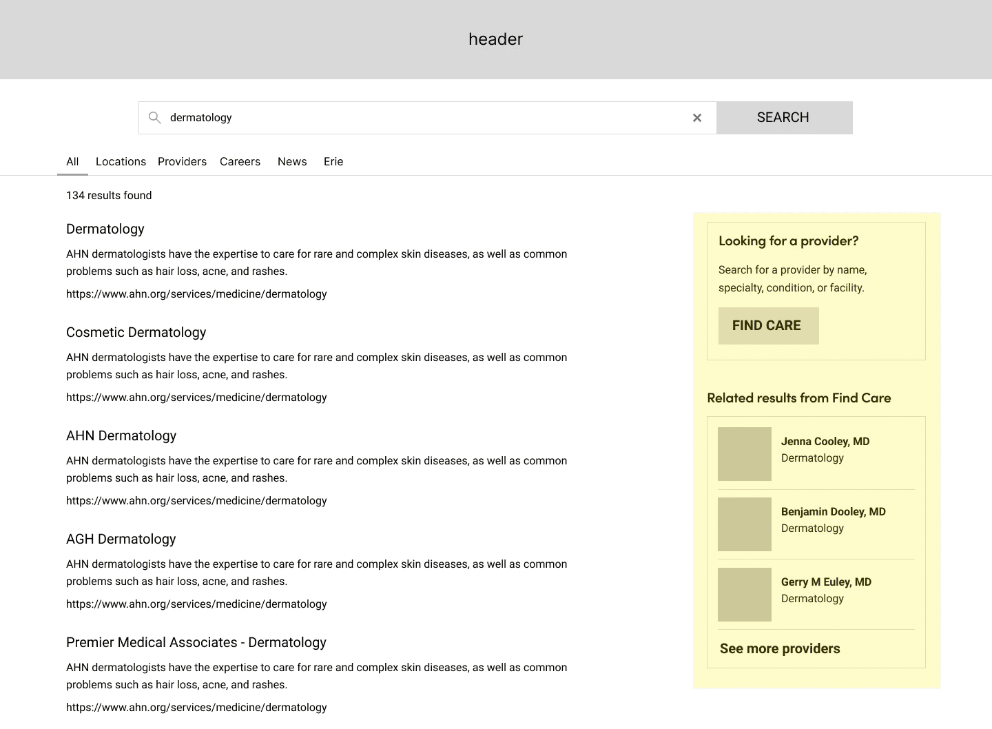
Sample scenario of what a user might see if they search for "dermatology", which is both a service line and a provider type.
Key design decisions
Source transparency - provider results are clearly attributed to Find Care. The domain shift is acknowledged, not hidden, which paradoxically made users trust the results more in testing.
"See more providers" as an intentional hand-off - rather than ejecting users into Find Care mid-search, the link is a deliberate escalation, "want more? here's the full tool." Framed as a feature, not a failure.
Provider card scope - cards show name, specialty, location, accepting status, and next availability. Which is enough to qualify, not enough to replicate Find Care's full interface.
Deliver: shipping and validating change
Search journey user-flow


Search results for "dermatologist"
Before
No filtering by page category type
Provider searches did not link to Find Care
No provider detail in results
After
Page category types (provider, service, location, press)
Provider cards with info shown inline
Transparent Find Care attribution
Deliberate hand-off link
What I learned
What worked
Naming the domain-shift problem explicitly, not just "search is bad", created visuals for use-case scenarios to help convey potential solutions to development and stakeholders.
What I'd do differently
I would have like to have access to some post-launch analytics to see how the update has impacted users.
What's next
Implementing tabs as a way to filter search results by category - which would allow users to better refine what they're looking for, i.e. service page vs location page.